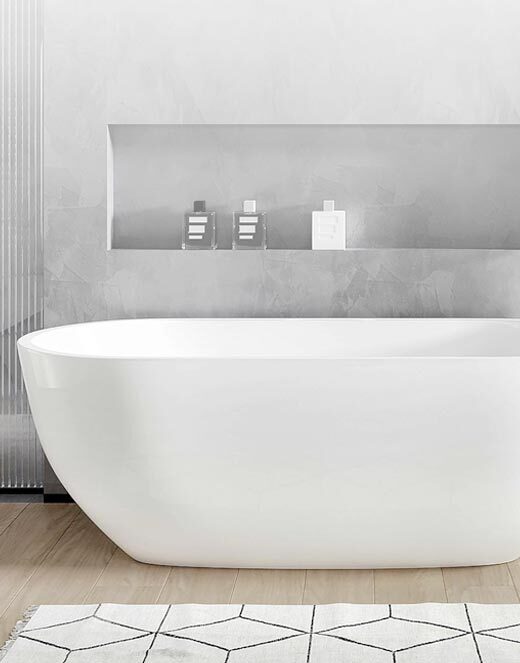
This design likely emphasizes a purple-toned palette, balancing subtle depth and elegance with the brand’s engineered surface performance. The name suggests a color phase—implying gradients or shifts in tone rather than a flat purple—so the result would be a surface that brings color character without overwhelming the space.
Key Attributes (Inferred)
-
Primary purple hues, possibly in mid to soft ranges (not overly dark or saturated)
-
Gradation or phase effects: tonal shifts or subtle transitions between lighter and darker purples
-
Minimal contrast details (veining or subtle texture), enough to give character while maintaining a refined, panel-friendly design
-
Engineered durability: moisture resistance, ease of cleaning, suitable for wall panels, showers, and wet areas
Suggested Uses
-
Accent / Feature Walls: where a distinctive color presence is desired, such as in living rooms, bedrooms, or foyers
-
Bathrooms & Shower Walls: to introduce a restful, colored backdrop in spa or personal spaces
-
Retail / Hospitality Spaces: boutique stores, lounges, or reception areas seeking a unique color statement
-
Decorative Panels / Color Accents: in areas where adjacent tones are neutral and the purple can act as a subtle design anchor
IntellaStone Small Wall System (3) 40" x 98" panels